Announcement

Collapse
No announcement yet.

Basket page on mobile

Collapse
X
 
  • Filter
  • Time
  • Show
Clear All
new posts

    Basket page on mobile

    There needs to be some updates to the basket page in Shadows & I'm hoping a future iteration can have it baked in rather than me having to pull from my own previous work each time. It's time consuming for me, and I feel like it doesn't need to be. Colossus has a much better default basket page that I can hit the ground running with. Where is Colossus 2.0??

    Left if default Shadows, right is an example of what I typically use, but it requires a lot of edits.
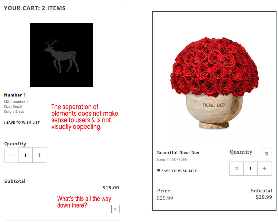

    I know it doesn't seem like a big deal, but users/clients typically complain when they have many items in the cart. I think this is something that's often overlooked – try adding 10+ items in a default Shadows store, go to the basket page and see how you'd feel as a first-time user. You might find yourself frustrated, especially when compared to most modern ecommerce sites.

    Happy weekend!
    -Ryan
    Last edited by RTHOMASDESIGN; 12-11-21, 01:17 PM.

    #2
    Hi Ryan,

    Thank you for the feedback. I am coming back on Monday, so I'll look into getting some changes integrated into the next Shadows release. As for Colossus 2, that is slated now for later in 2022.
    Matt Zimmermann

    Miva Web Developer
    Alchemy Web Development
    https://www.alchemywebdev.com
    Site Development - Maintenance - Consultation

    Miva Certified Developer
    Miva Professional Developer

    https://www.dev4web.net | Twitter

    Comment


      #3
      I'd add that, along with some general cleanup, you need TWO basket templates. One for stores that people only one or two (more like you have now) and one where people are ordering MANY items in which case a list line with just an 'edit' button to the full basket.
      Bruce Golub
      Phosphor Media - "Your Success is our Business"

      Improve Your Customer Service | Get MORE Customers | Edit CSS/Javascript/HTML Easily | Make Your Site Faster | Get Indexed by Google | Free Modules | Follow Us on Facebook
      phosphormedia.com

      Comment


        #4
        Originally posted by Bruce - PhosphorMedia View Post
        I'd add that, along with some general cleanup, you need TWO basket templates. One for stores that people only one or two (more like you have now) and one where people are ordering MANY items in which case a list line with just an 'edit' button to the full basket.
        Hi Bruce,

        Can you post up a screen-shot of a site that does this well?
        Matt Zimmermann

        Miva Web Developer
        Alchemy Web Development
        https://www.alchemywebdev.com
        Site Development - Maintenance - Consultation

        Miva Certified Developer
        Miva Professional Developer

        https://www.dev4web.net | Twitter

        Comment


          #5
          well is subjective. but i think have the bare bones to support something like what's used on redrivercatalog.com (basically old school basket list) would be helpful
          Bruce Golub
          Phosphor Media - "Your Success is our Business"

          Improve Your Customer Service | Get MORE Customers | Edit CSS/Javascript/HTML Easily | Make Your Site Faster | Get Indexed by Google | Free Modules | Follow Us on Facebook
          phosphormedia.com

          Comment

          Working...
          X