So happy Miva 10 is out... It's like Christmas around here!! Props to the team at Miva :)
Anyway, I just installed Miva 10 on one of my dev sites and had a client poke through it. So far we've noticed a couple things that make order processing more difficult than it was.
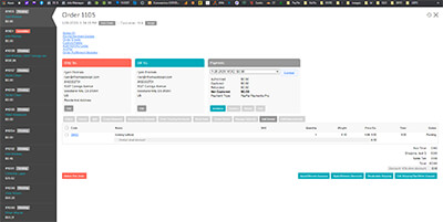
This is probably just a bug and will be fixed soon, but we've noticed that when clicking on an order to get to the order details screen... the old Miva 9 layout still loads in (only difference is the lock icon):
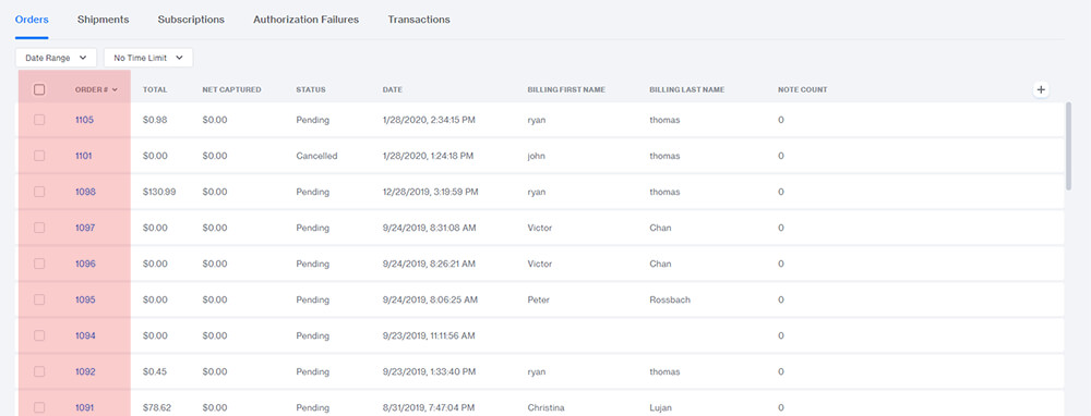
Selecting orders is no longer as intuitive. It was much easier to click and drag (or shift/ctrl click) anywhere within the order list to select the orders you want to batch/edit/etc. Not sure why this functionality was removed. It'd be nice if you could click and drag anywhere, but if you hovered over a custom field you could still edit it inline. Honestly, I preferred the old version over this.
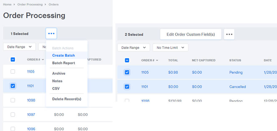
"This is dumb", and I have to agree. I don't understand why the dedicated buttons were removed here. Who the heck decided that "edit custom fields" deserved a button, but batch report/notes didn't? Ya it looks cleaner, but it's certainly not as intuitive (and there's more than enough space). It would be awesome if you could break out a couple of these. There has to be so many stores that use batch reports/notes every time they're prepping orders.
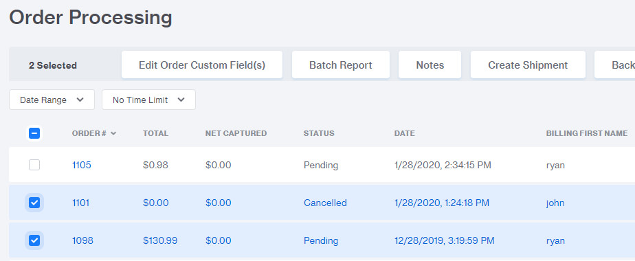
Wouldn't this be nice?
Anyway, those are my two cents on order processing. Enjoying everything else I'm seeing so far!
-Ryan
Anyway, I just installed Miva 10 on one of my dev sites and had a client poke through it. So far we've noticed a couple things that make order processing more difficult than it was.
This is probably just a bug and will be fixed soon, but we've noticed that when clicking on an order to get to the order details screen... the old Miva 9 layout still loads in (only difference is the lock icon):

Selecting orders is no longer as intuitive. It was much easier to click and drag (or shift/ctrl click) anywhere within the order list to select the orders you want to batch/edit/etc. Not sure why this functionality was removed. It'd be nice if you could click and drag anywhere, but if you hovered over a custom field you could still edit it inline. Honestly, I preferred the old version over this.

"This is dumb", and I have to agree. I don't understand why the dedicated buttons were removed here. Who the heck decided that "edit custom fields" deserved a button, but batch report/notes didn't? Ya it looks cleaner, but it's certainly not as intuitive (and there's more than enough space). It would be awesome if you could break out a couple of these. There has to be so many stores that use batch reports/notes every time they're prepping orders.

Wouldn't this be nice?

Anyway, those are my two cents on order processing. Enjoying everything else I'm seeing so far!
-Ryan
Comment